Project Scope
Create branding with hand-written script to explore the use of analogue typography in conjunction with hand-created typography. Alongside the logo with your hand-written script, build out a full brand to accompany it.
Inspiration
Wild & Whisk is an organic bakery and farm-to-table café concept whose identity is built around sustainability, community, and artisanal quality. The branding system was developed to capture the warmth of locally made food while maintaining the clarity and adaptability needed for a modern business.
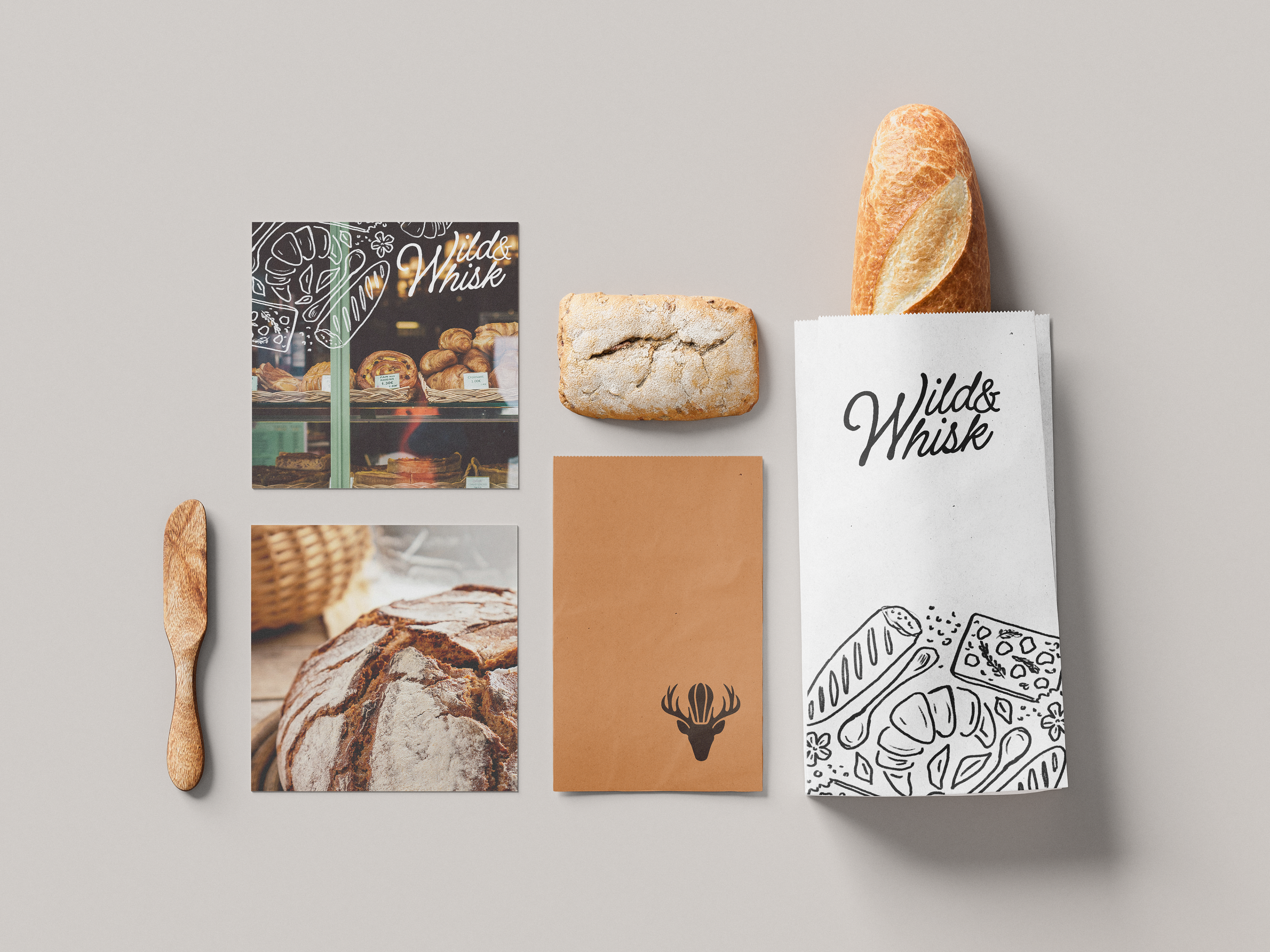
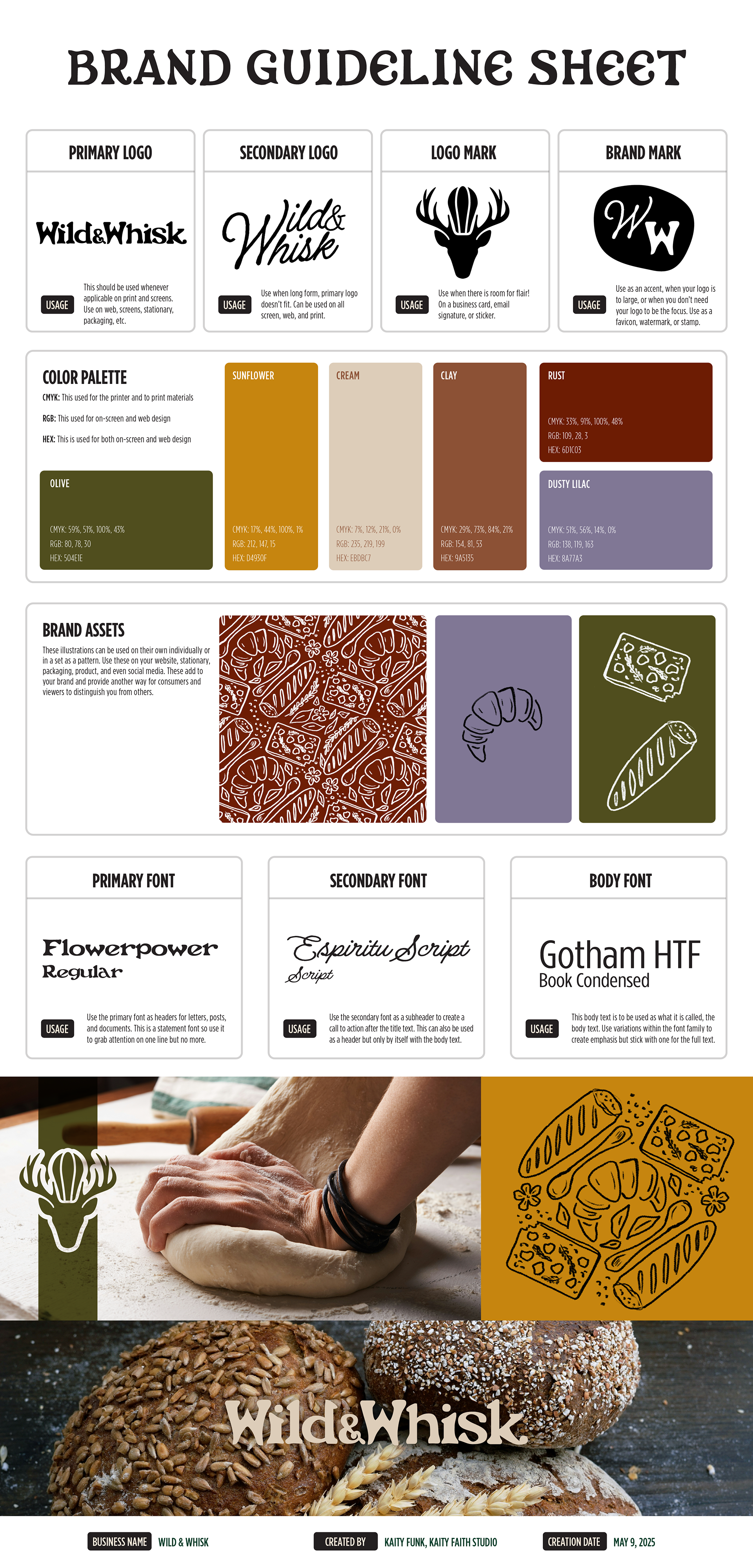
The visual identity combines a rustic serif typeface for storytelling and large-scale applications with a clean sans-serif for functional clarity, reflecting the dual nature of the brand—grounded in tradition yet relevant to contemporary audiences. The earthy color palette of sage, terracotta, oat, and cream, accented with berry and citrus tones, reflects seasonal freshness and natural origins.
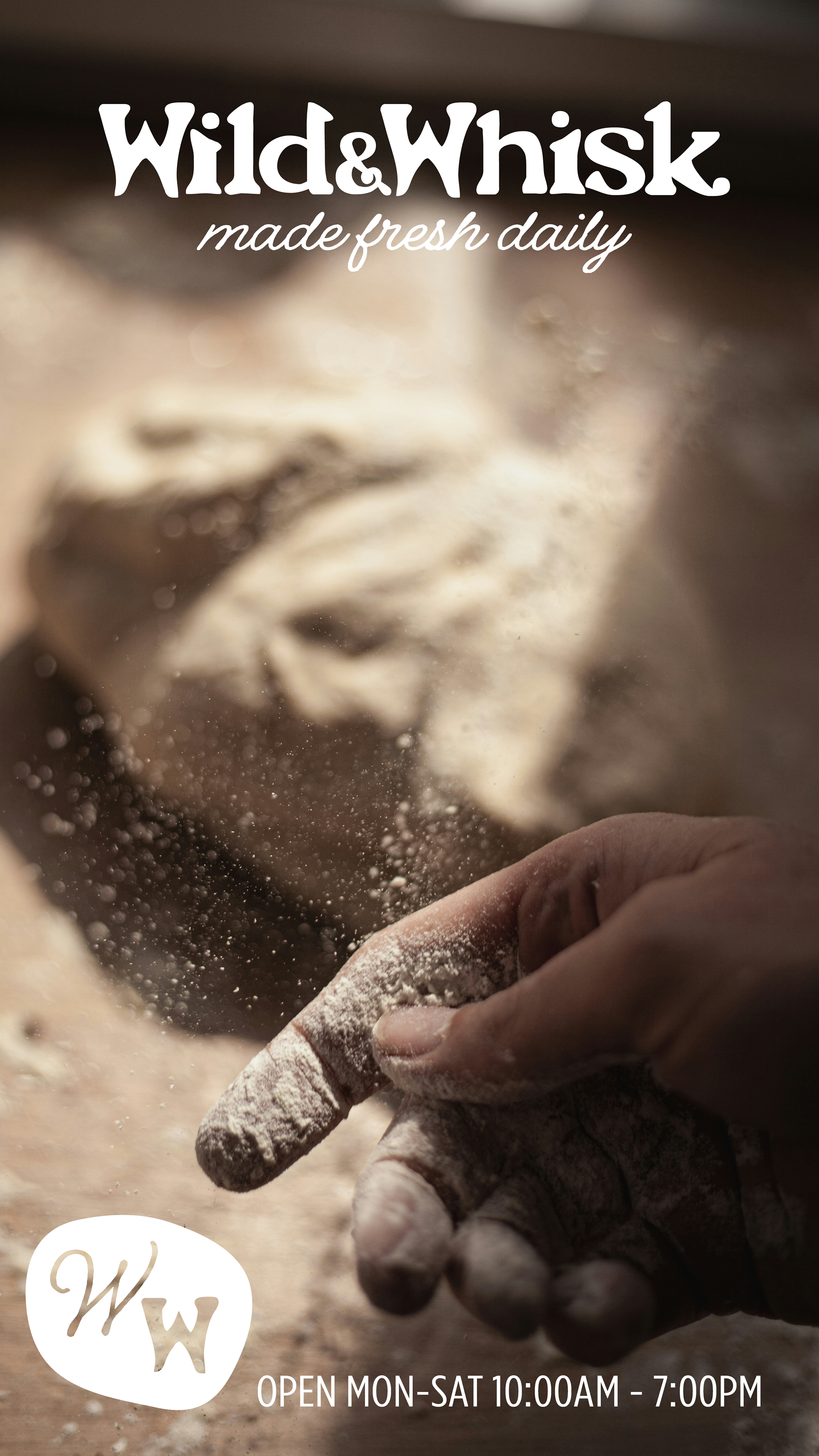
Textures such as kraft paper backgrounds and hand-drawn botanical illustrations add tactile authenticity, while flexible logo variations ensure the design works across packaging, signage, menus, and digital media. Stationery and marketing materials were designed with generous white space, natural textures, and bold type to create a warm and welcoming visual language.
Every brand element—from the refined logo marks to the color and typography choices—was designed to ensure cohesion and evoke a personal, grounded experience for the audience. The result is a branding system that not only supports a strong visual presence but also communicates the brand’s deeper values of sustainability, craftsmanship, and connection to the land.
Social Posts
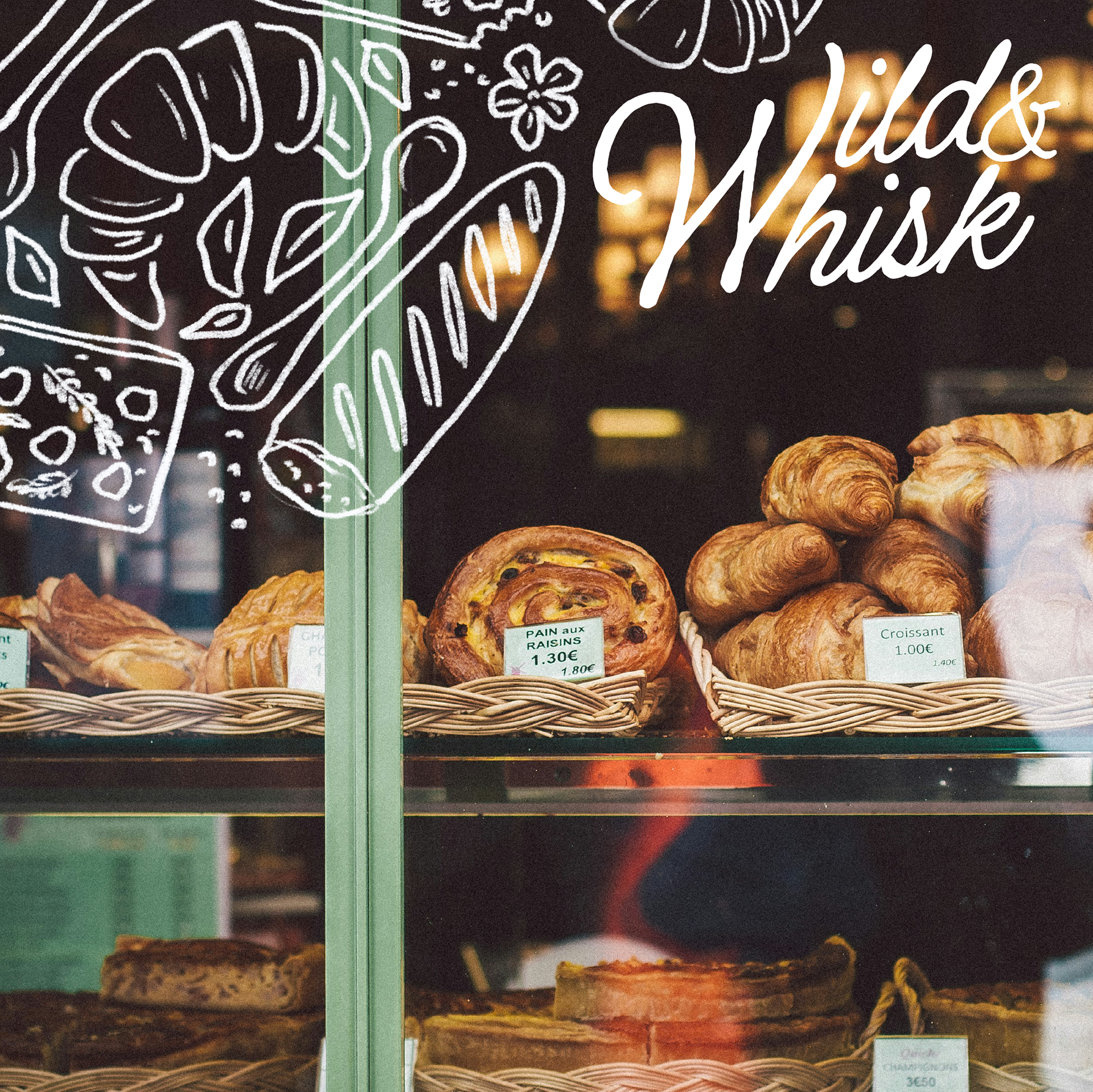
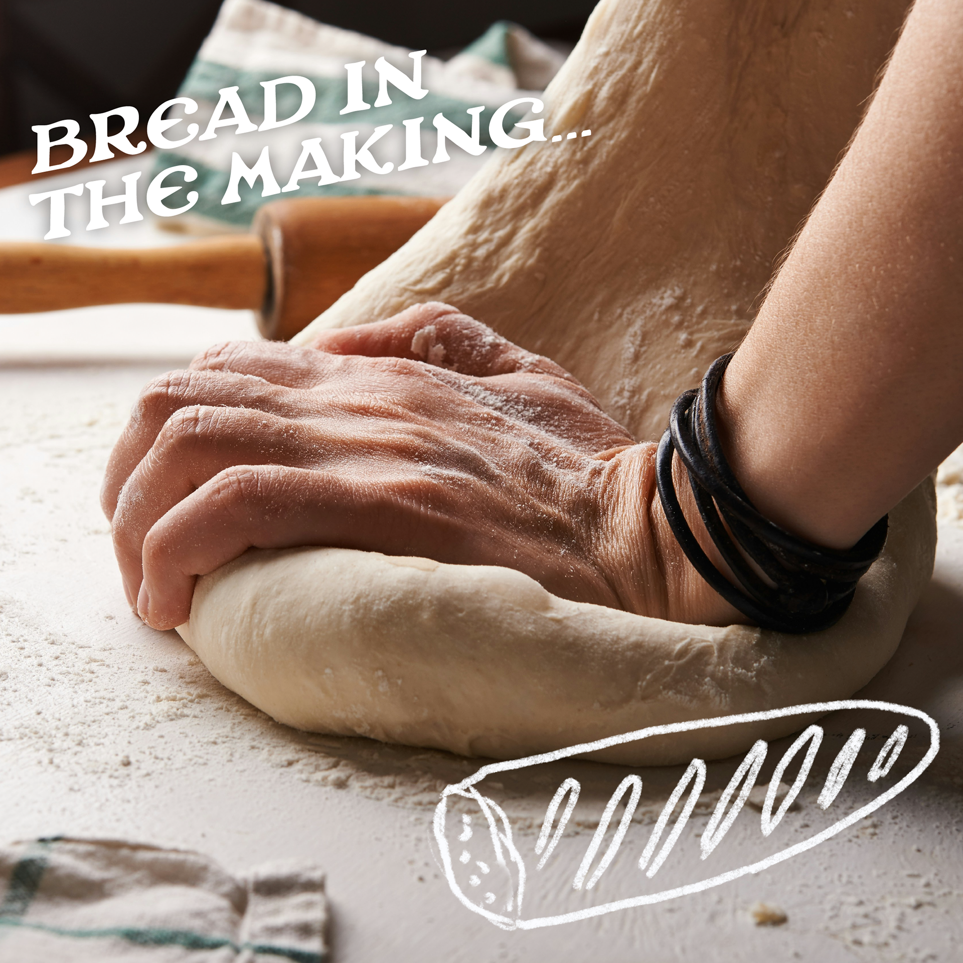
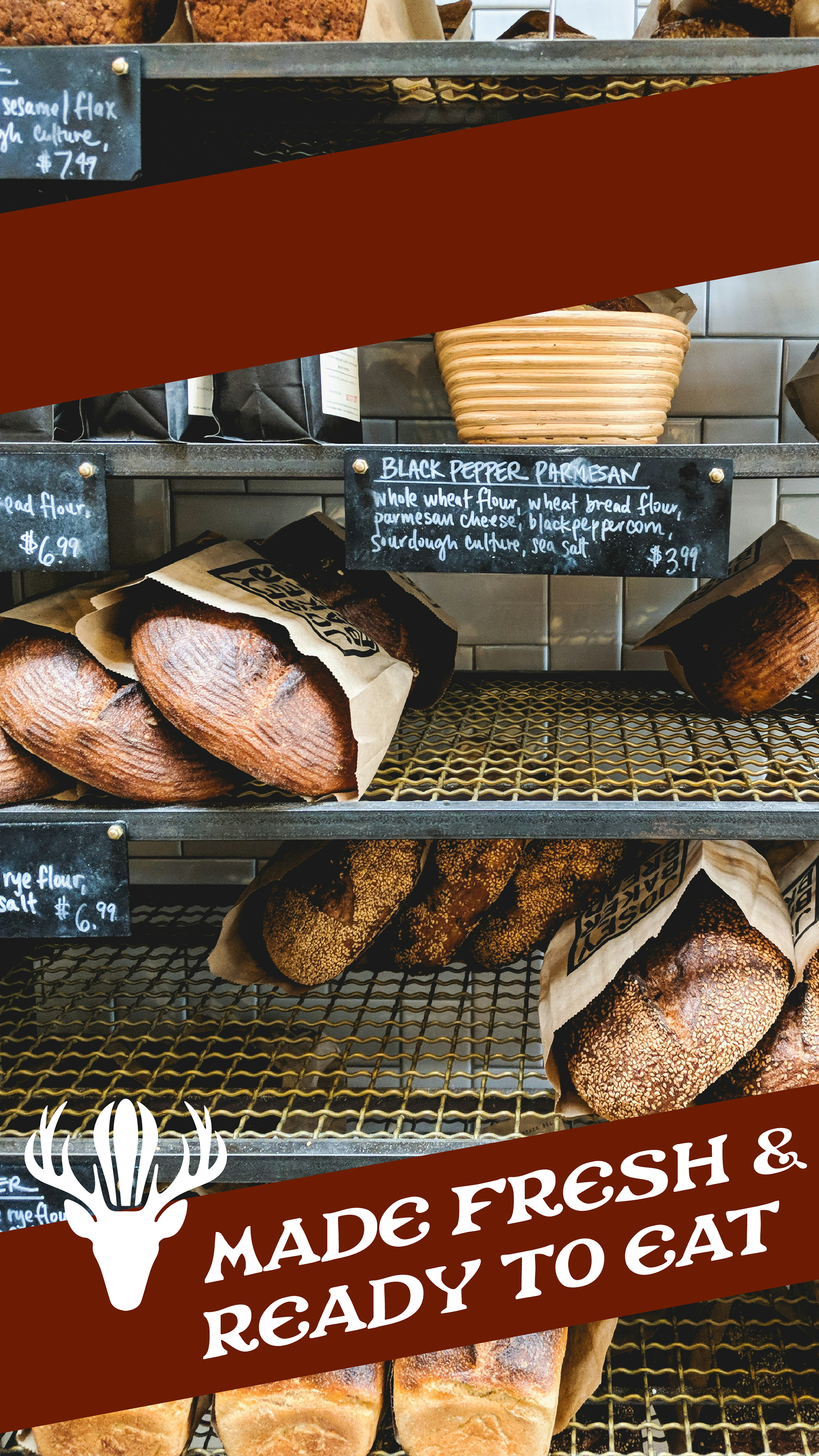
Branding


Illustrations