Project Scope
Find a creative solution that helps to add to design for good. Find an issue in our society and come up with a creative solution to help.
Inspiration
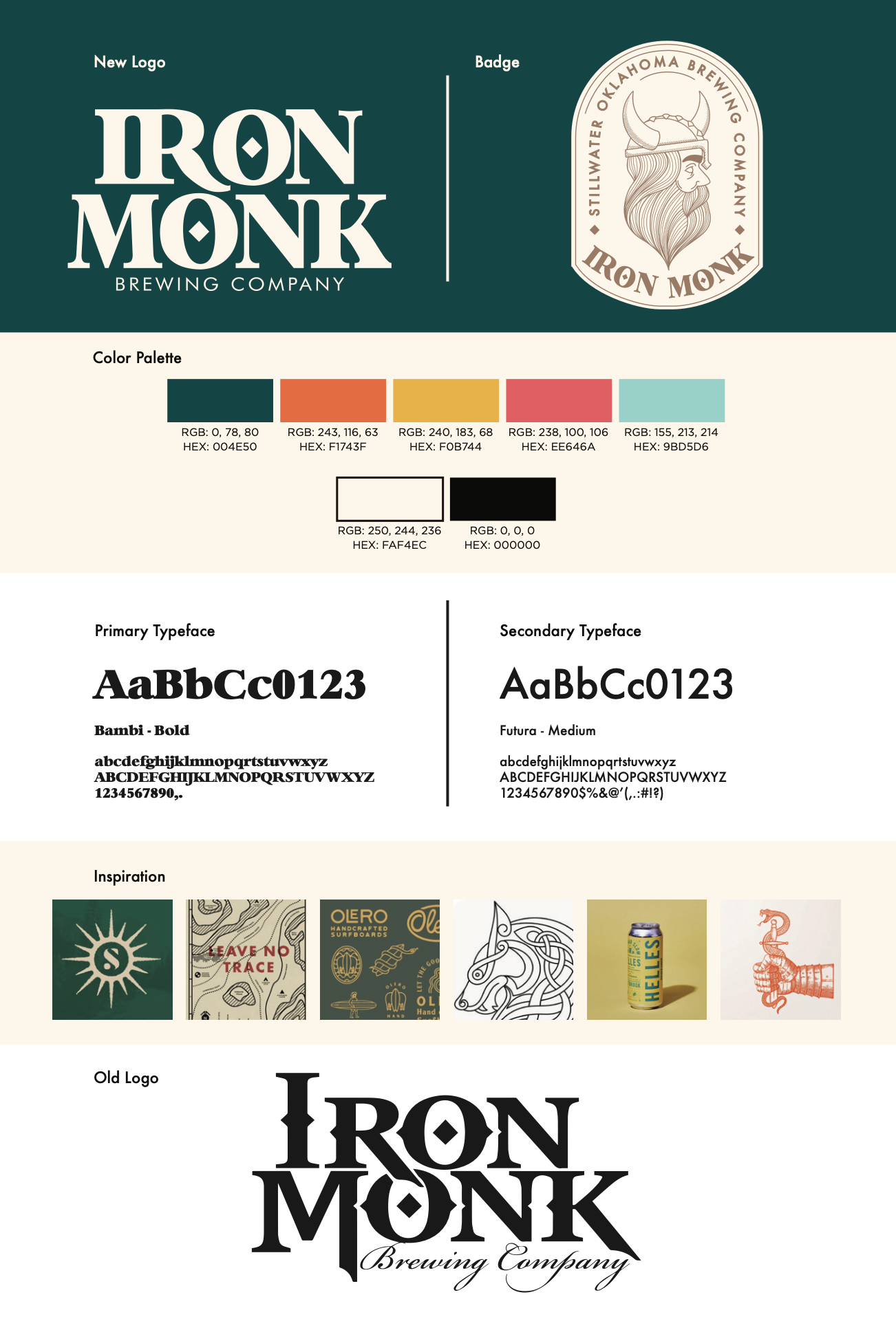
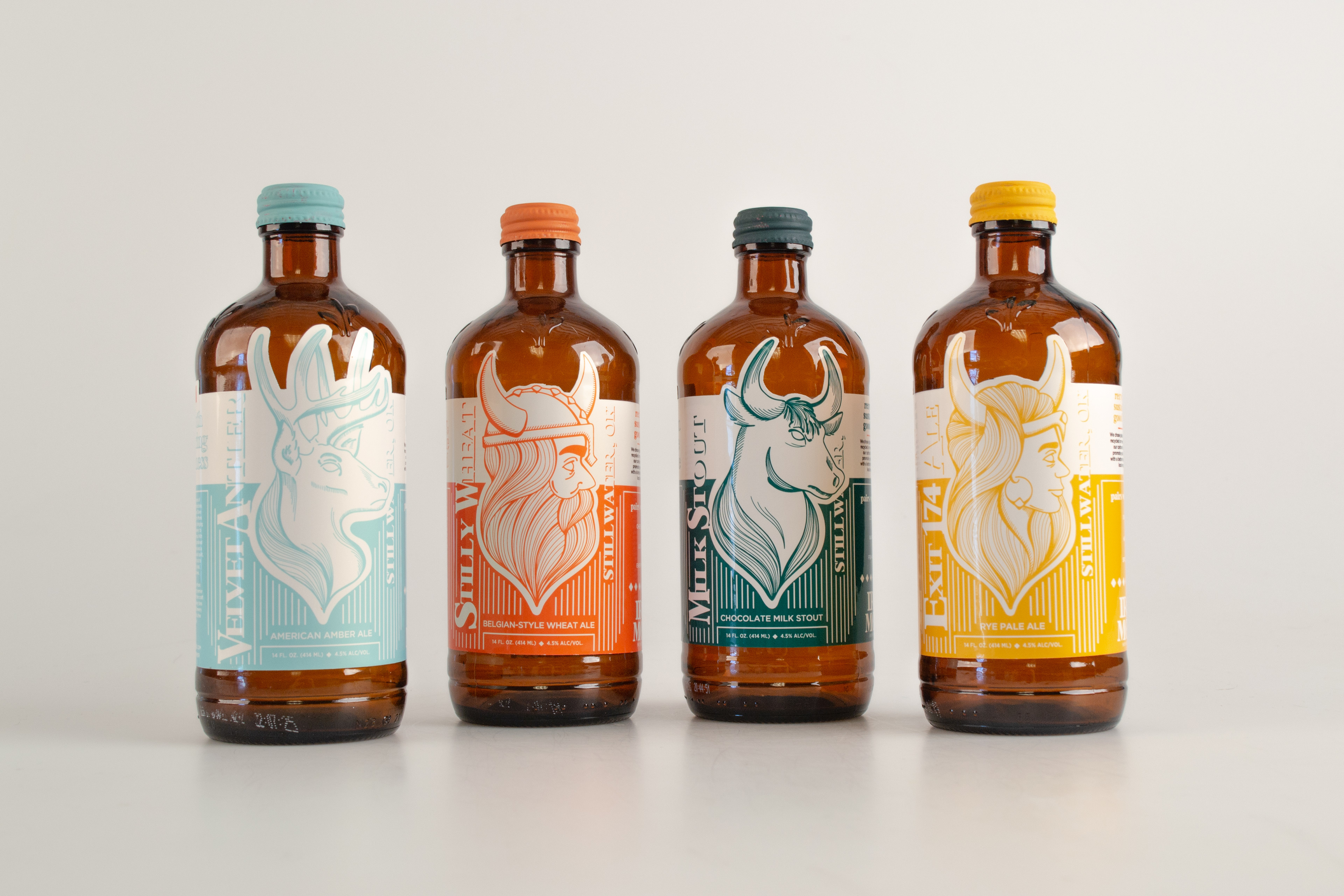
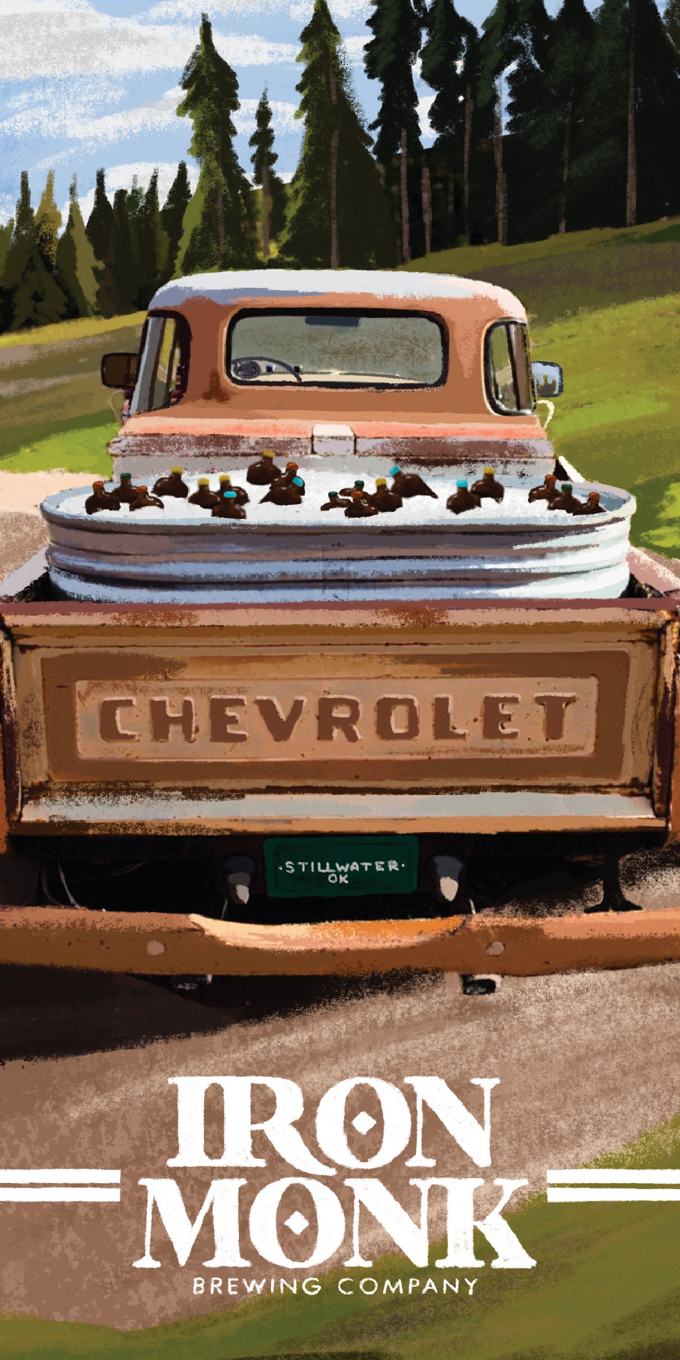
I combined two of my biggest passions, sustainability and craft beer, to create a branding project that demonstrates how thoughtful design can make a positive impact. The project began with a redesign of the Iron Monk logo, giving the brand a more modern identity while maintaining its bold character. From there, I extended the new visual language across a series of bottle labels. The illustrations were originally inspired by the Viking featured on one of Iron Monk's beers, The Nine. I loved how the Viking complemented the brewery's Scandinavian-inspired branding, making it the perfect foundation for a cohesive packaging system.
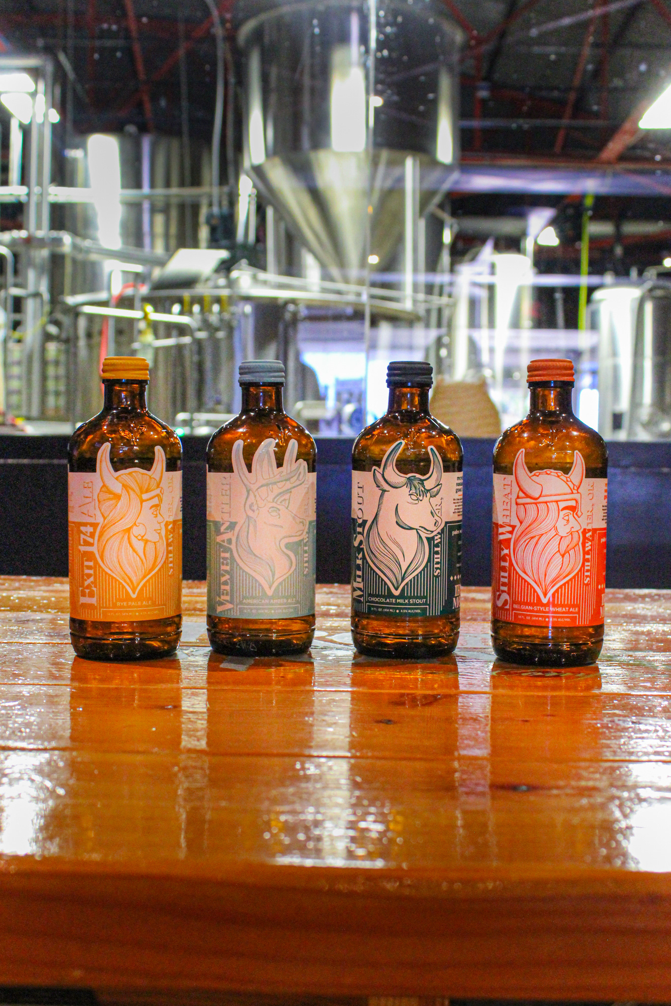
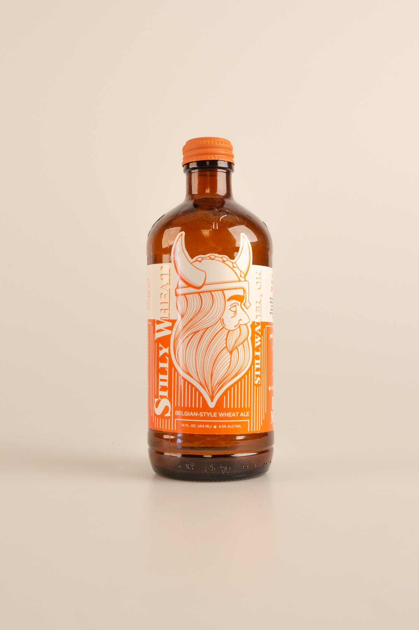
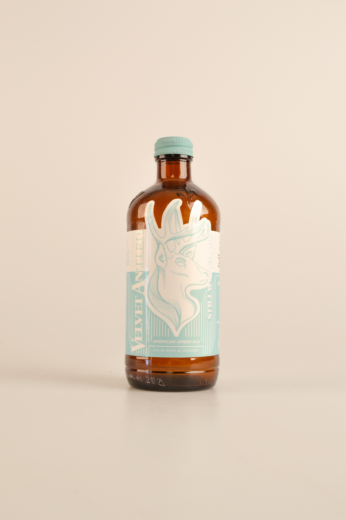
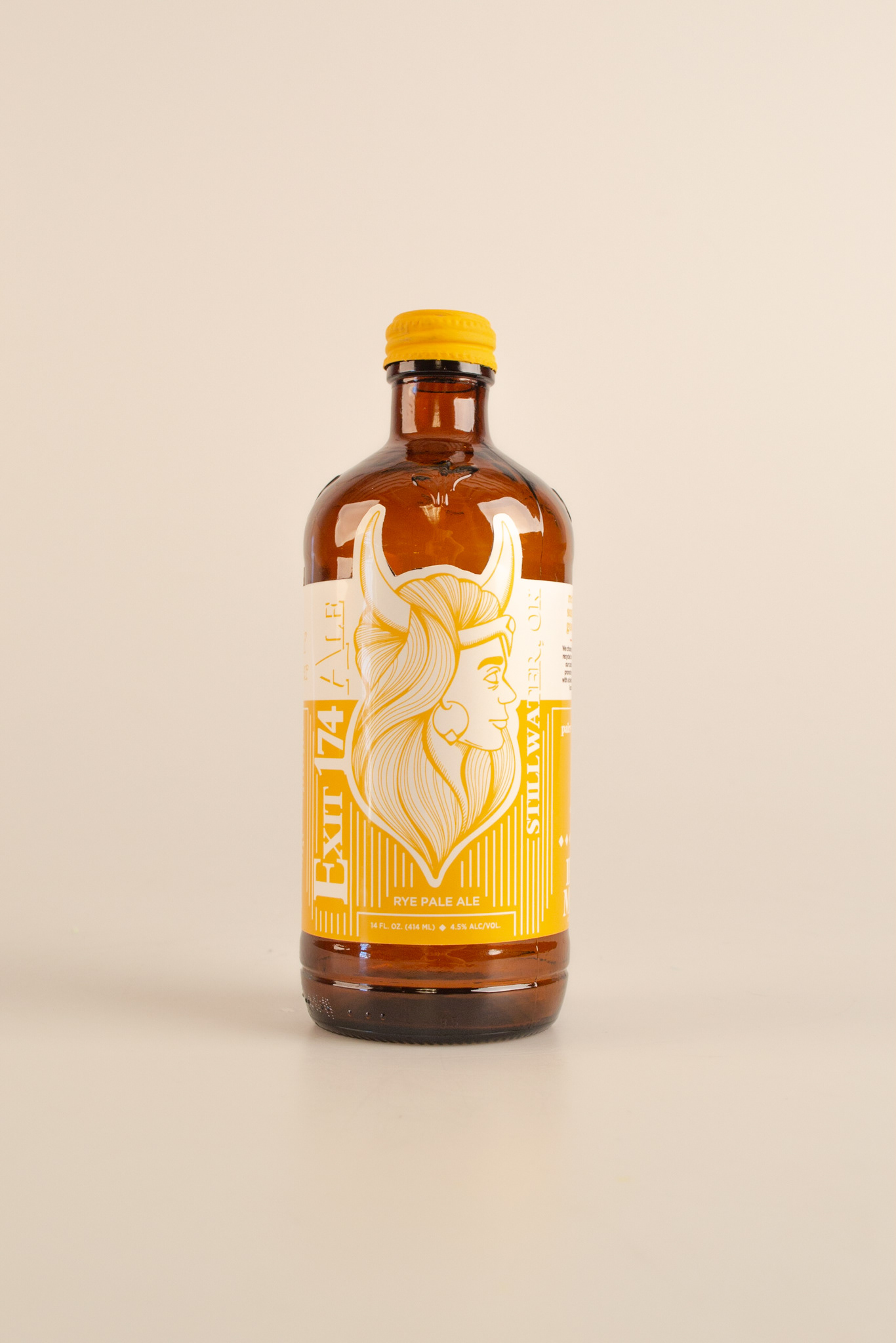
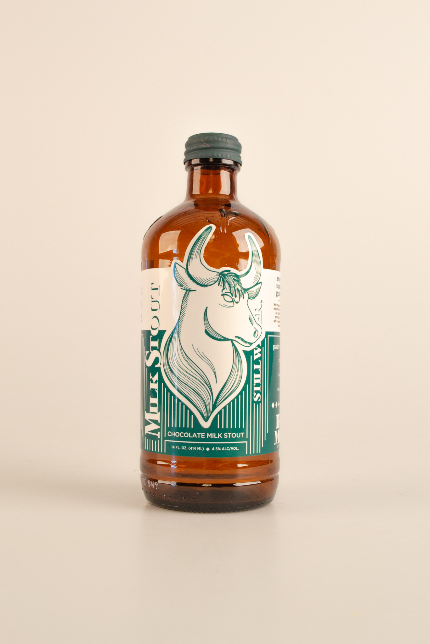
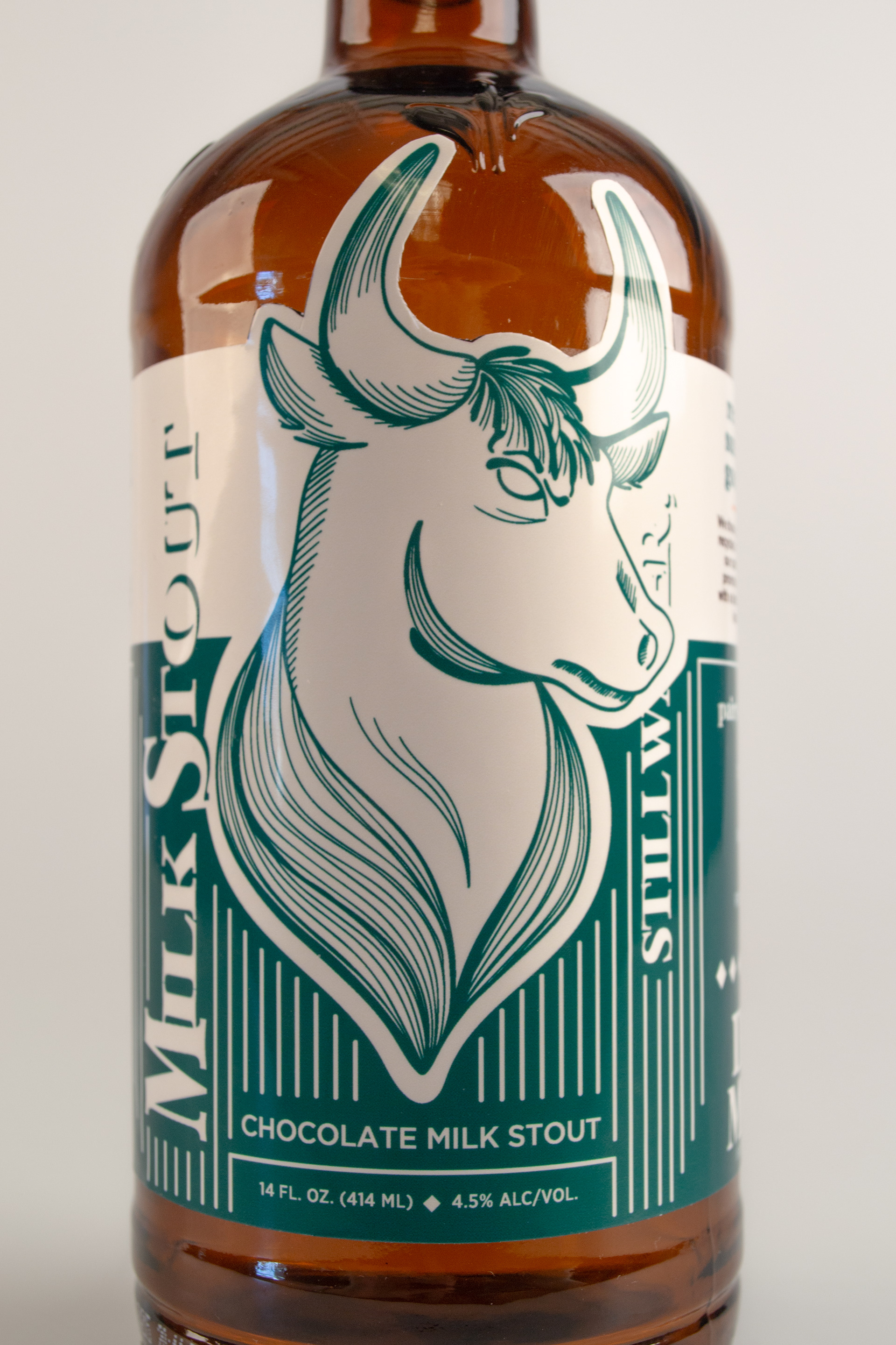
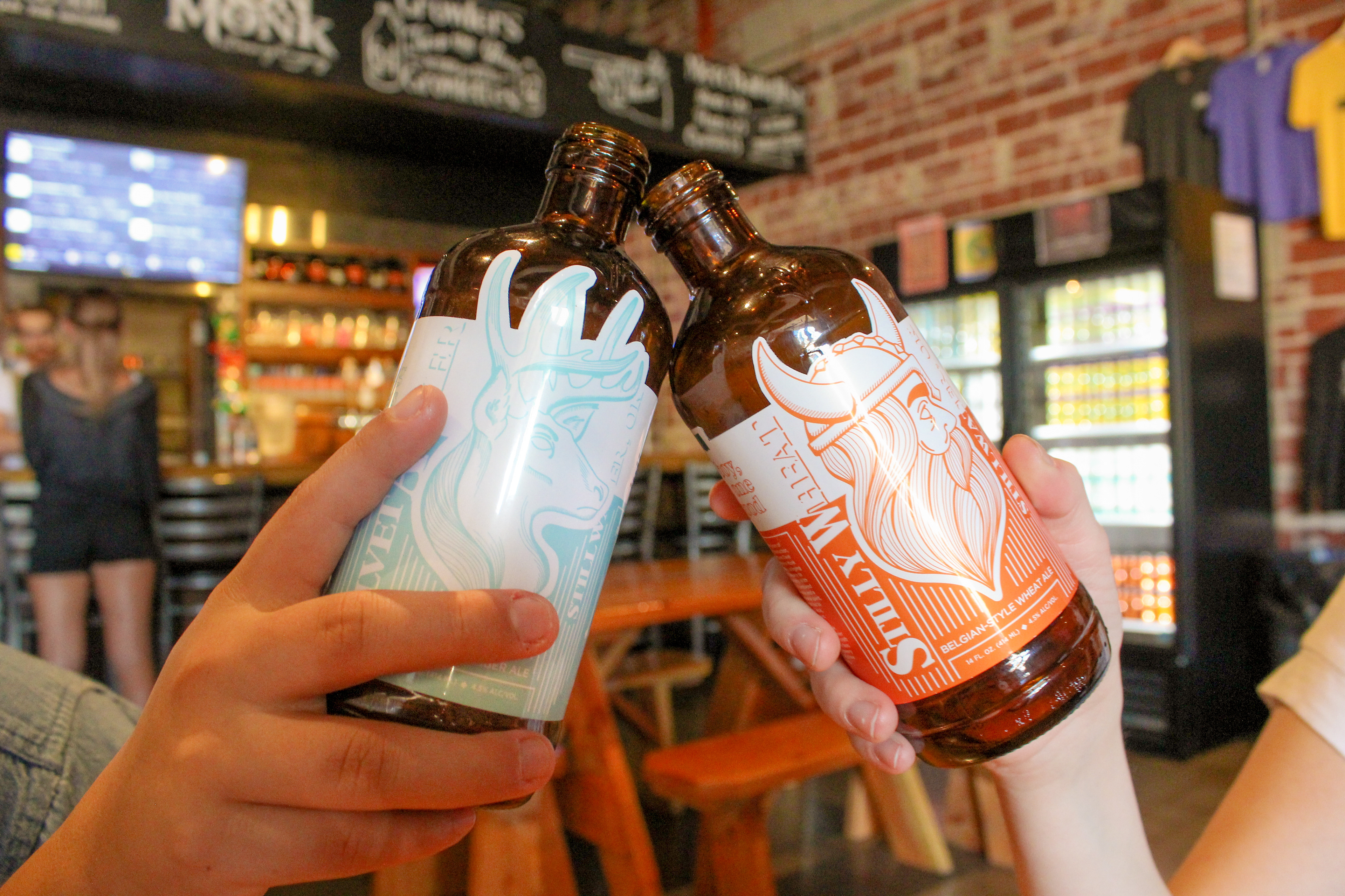
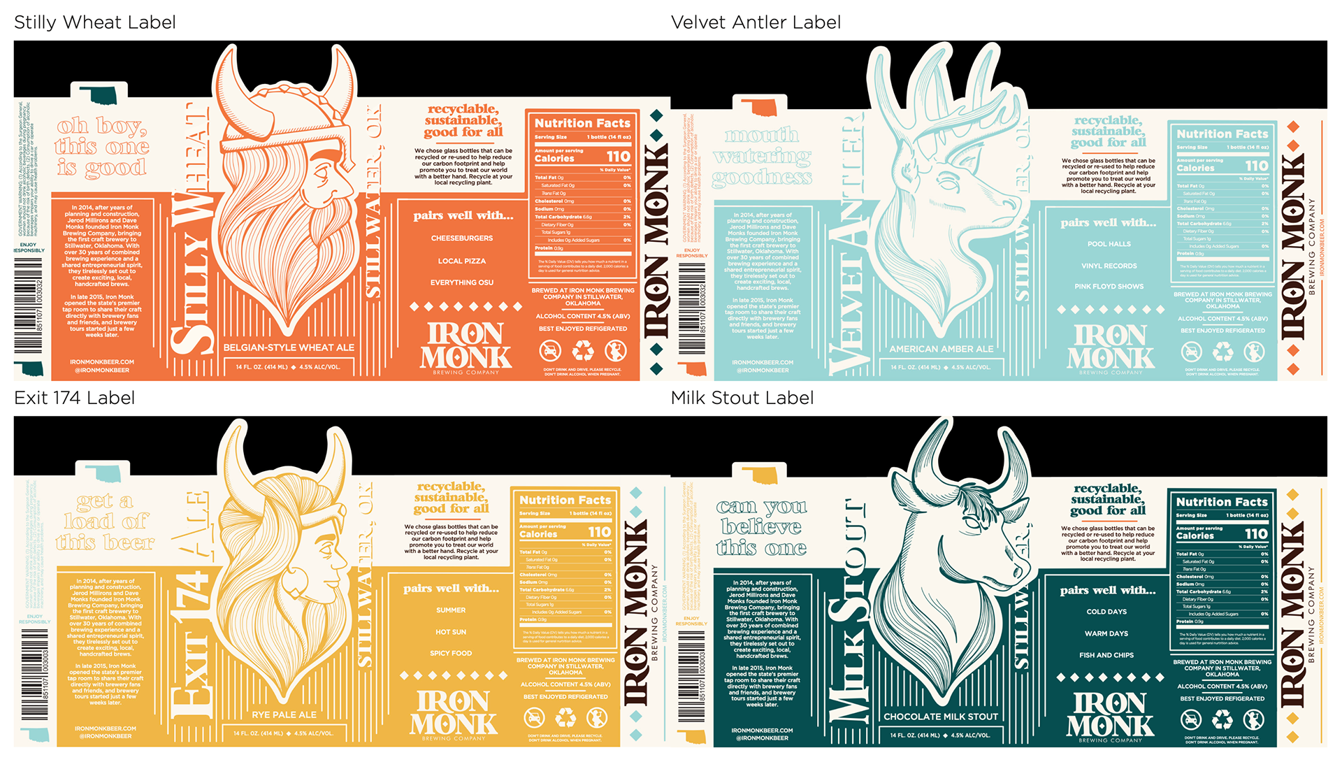
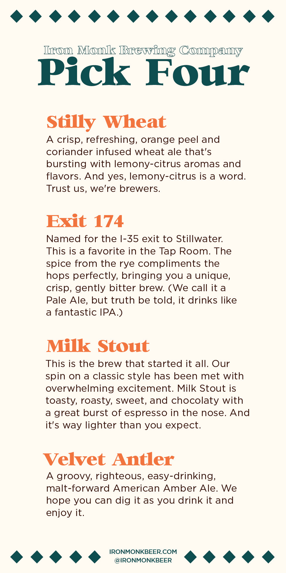
Stilly Wheat, Iron Monk's flagship brew, features the reimagined Viking and became the inspiration for the rest of the collection. Exit 174 introduces a female counterpart to the original Viking. As one of my favorite beers, I wanted the design to embody a confident, femme-fatale energy while reinforcing that great craft beer is for everyone. Milk Stout features a powerful bull whose strength reflects the bold, rich flavor profile of the beer. Finally, Velvet Antler showcases a majestic buck with an impressive rack, celebrating the adventurous, outdoorsy spirit that pairs perfectly with the brew. Together, the collection creates what I like to call a Modern Viking aesthetic—bold, approachable, and unmistakably Iron Monk.
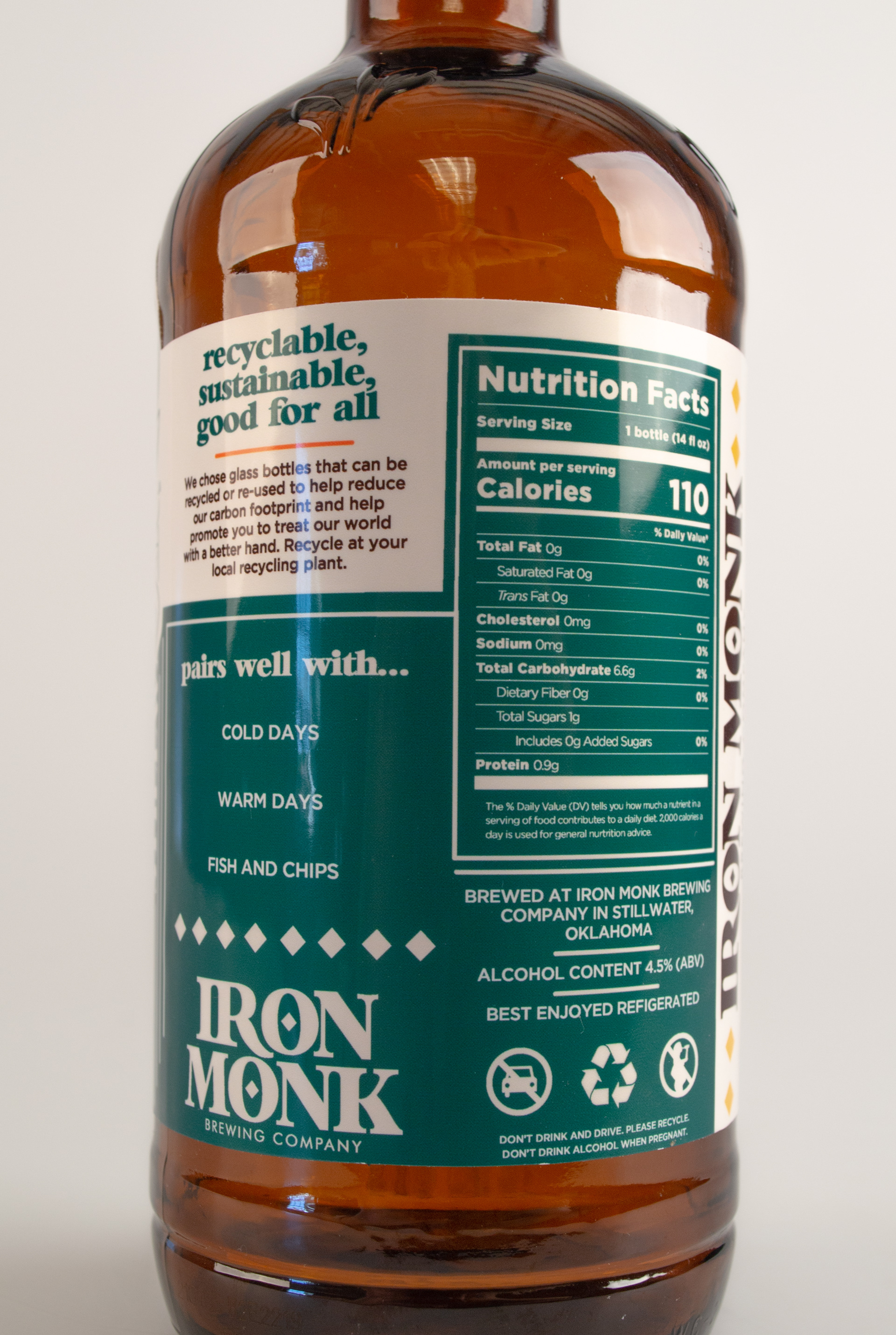
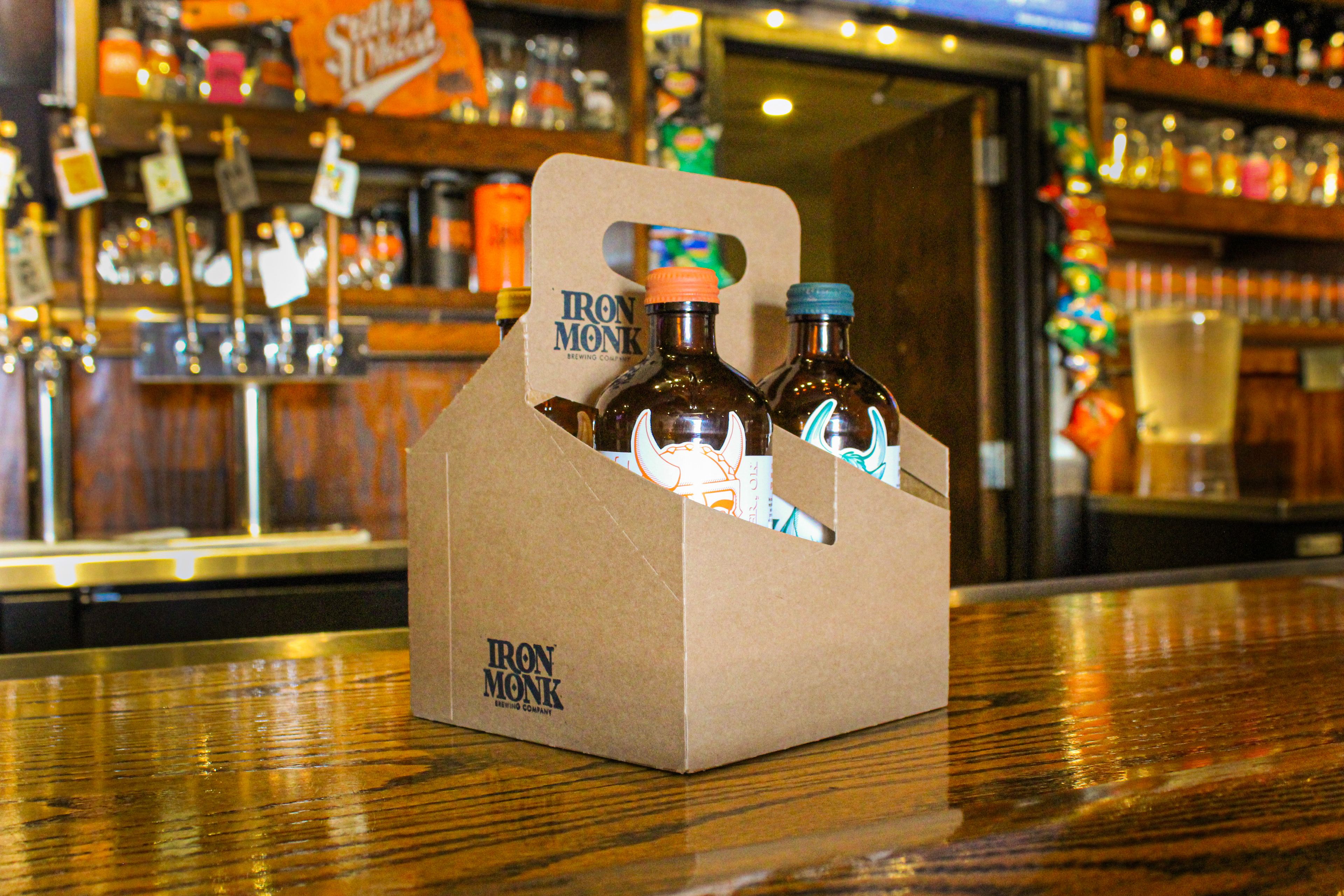
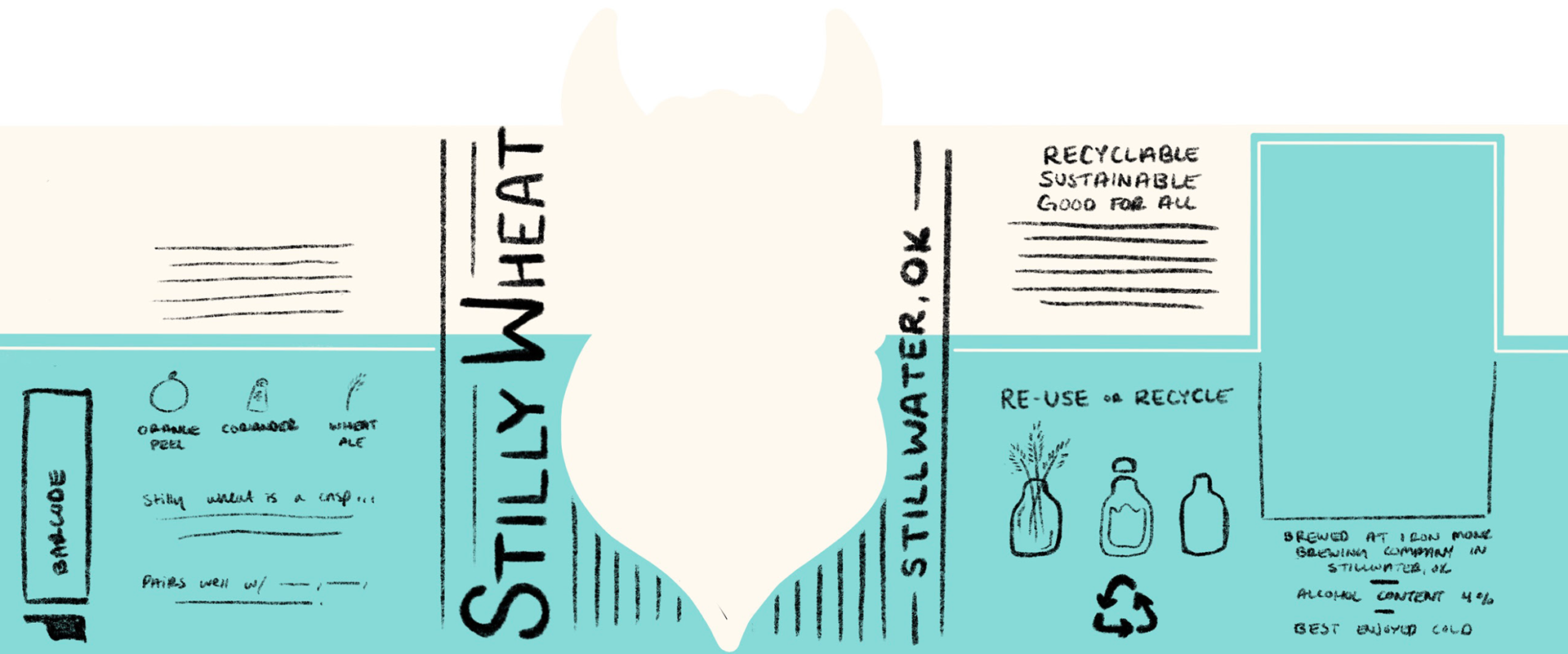
Sustainability was considered throughout every stage of the redesign. Rather than using aluminum cans, I chose reusable glass bottles. Glass can be recycled repeatedly without degrading in quality, making it a more sustainable long-term packaging option. The bottles are also designed with reusable screw-top caps, encouraging customers to repurpose them as drink containers, storage jars, or even small flower vases long after the beer is gone.
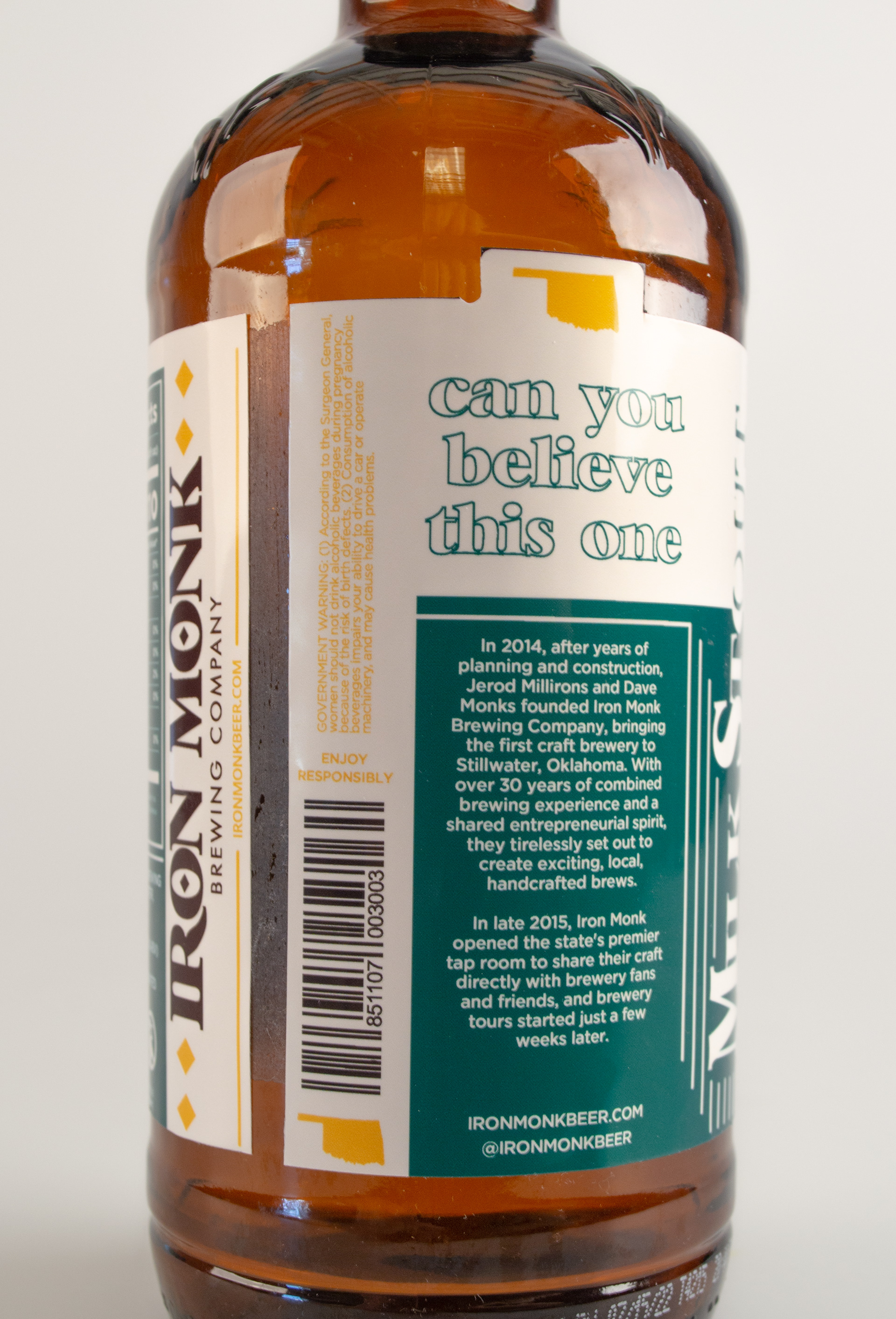
The labels are printed on recyclable paper and adhered with a food-grade, corn syrup-based adhesive, allowing the packaging to be recycled with minimal environmental impact after use. Finally, the six-pack carriers were redesigned using recyclable cardboard, replacing less sustainable alternatives. This project challenged me to think beyond aesthetics and consider the entire lifecycle of a product. It demonstrates how branding and packaging can not only capture attention on the shelf but also encourage more sustainable choices—proving that great design can be both beautiful and responsible.
Full Labels
Iron Monk Flight Card
Iron Monk Branding